Over the years and through my study of Master's paintings (in books and in galleries) I have made note of a number of criteria that embrace
what is so attractive in classical art. While I have called them 'rules' they do not fit all painting all the time but instead I use these to think about what
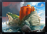
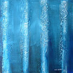
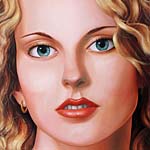
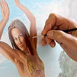
I am to paint before placing brush to board. The image on the left shows a stage in the progression of my interpretation of St George and the Dragon.
1. Expression of Subject
The characters of your painting are players in a scene. Their facial expressions and body positions are intrinsic to the story you are telling.
2. Lighting
The lighting of your painting should predominate on the principle subjects focusing on important items and expressions.
3. Detail
The principle subjects should be clearly defined and well drafted while background and non-principle subjects less well lit and more roughly defined.
4. Indicate Movement
Rubens is the Master of creating movement. Use Rubens to see how gesture, drapery and landscape can create paintings with a dramatic sense of movement rather than a static image.
5. Limited Palette
Use a limited colour palette with a bias toward earthy colours. Refrain from overly bold intense factory colours. My classical palette is: Titanium White, Naples Yellow, Cadmium Yellow, Yellow Orche, Scarlet Lake, Cadmium Red, Venetian Red, Burnt Sienna, Raw Umber, Cerulean Blue, Prussian Blue, Van Dyke Brown.
Note that I do not use Black, instead I mix Prussian Blue with Van Dyke Brown.
6. Use of Green
Mix greens from blue and yellow rather than using tube manufactured greens. For landscape mixing greens from blue and yellow helps limit your palette while maintaining a balance of hue. Factory produced greens are often overly rich in intensity which may be fine for drapery but not for foliage.
If you use green from the tube muddy it with browns.
7. Pure Blacks and Whites
Obstain from the use of pure white or pure black. Pure white should be used only as small highlights to reflected areas. Pure black appears dead, instead mix with Prussian Blue for a cool black or Alizarin Crimson for a warm black.
8. Underpainting
Build you initial sketch over a coloured ground. My preference is for a Venetian Red wash but some artists used drab greens, some yellows. Use sepia tones in shadow areas to build up the painting. Layer a little white into the principle areas of light. Use colour in the final layer once you are happy with the monochromatic image.
9. Fat over Lean
See the technique of Fat Over Lean in building up your Underpainting.
10. Softness of Line
Edges should be feathered and soft rather than hard and sharp. This is particularly so in large portrait or nude works where the edges of the form often bleed into the background or surrounding colour. Often the opaque skin tone will stop short of the artists penciled edge leaving the background colour visible. Edges that are hard and sharp look contrived and controlled,
and while this is what we aim to be, we do not want to portray it as such. Softening foreground edges gives a feeling of expression and lets the eye dictate the line.
Tip:
Adjust perspectives and lighting away from real life to accentuate mood or movement. Perhaps the most well known example of this is the Mona Lisa where the horizon on the left is higher than that on the right.
|
|

GENERAL ART TECHNIQUES
- Applying a Base Coat
- Choosing a Subject
- Colour
- Colour II
- Creating an Abstract
- Dealing with Critics
- Design
- Developing A Painting
- Developing A Style
- Fat Over Lean
- Hue, Tone & Intensity
- Perspective

PAINTING LANDSCAPES
- Aerial Perspective
- Composition
- Drawing Trees
- Using Tone

PAINTING MATERIALS
- Basic Colour Palette
- Basic Colours Continued
- Bristle Brushes
- MDF board
- Oil Paints
- The Camera
- Varnishing Artwork

PAINTING NUDES
- Complexity of Form
- Public Reaction
- Skin Tone
|